This group of artists have a gallery in a caravan and exhibit in various towns. These images can be shown in postcard form, however they are completely different to the typical kind. These images are stereotypical and very mundane and banal. These images are something that are not very attractive, however can be seen humorous to those living near or in the town they have been photographed in. The postcards here both have very similar styles, which match all the other images in the collection.

- Image has been taken on a digital camera, which gives a high quality image and attracts the audience. This in turn sells the postcard. For a more artistic or vintage feel, 35mm film could have been used. Lenses used could be a zoom lens and a standard lens (28-50mm). The models look very uninterested in the camera, so perhaps they haven't seen it. The images look very unedited and natural, suggesting little or no photoshop on the image before printing, except putting the images in. Images uses a slight narrow depth of field, around f8, as the background isn't too blurred. There is also a fast shutter speed, which has made the images without movement and captures the subject in the act.
- Bright red border contrasts with the white text. Its garish and makes the card unattractive, however this matches with the theme of the card and makes them what they are.
- The images again follow the theme of banal and the mediocre.
- Instead of the images highlighting the typical tourist locations of the city, it follows the tourists themselves and the most common scenes in the location, without no regard to how boring or dull the action is.
- Postcard is not very typical in following the theme of a good holiday. It is more of an humorous satire of English holidays and locations.
- Font is bold and very similar to those in other postcard designs.
- Layout: 4 images with a common theme;
All surrounded with the red border, the images don't merge
Layout is simple and organised; Use of red attracts the audience.
- This postcard consists of 4 images, all using natural lighting and shows sights around Birmingham.
- The layout is the same as the image above, with 4 images being shown, all these images are landscape, which allowed easier putting on the layout.
- Again the text and border colours contrast and direct the audience towards the text.
- The images use natural lighting, a fast shutter speed and a narrow depth of field. This allows the postcard to portray the theme of banal and mediocre.
- The image doesn't have any advanced photo editing on, the only editing shown would be levels and possibly increasing or decreasing the saturation to make the postcard attractive, but still fit the galleries style.
- The images suggest a standard lens with a medium quality dslr. The images are high quality for what they are, however following the style, a lower quality camera may fit more.

Contact sheet:

My edits:

- Edit is similar to caravan gallery in its style. Consists of 3 images sharing the theme of rain.
- Light source is natural which adds a realistic and dark tone to the image - proves the image wasn't staged and matches theme of rain and typical English holiday.
- Left images have a narrow depth of field to capture the amount of rain droplets. This focuses the audience onto this and backs the theme.
- Colour: All images are slightly desaturated to add to the theme of dull and mediocre, this is similar to Caravan Gallery.
- Images all use a fast shutter speed to freeze the movement - this makes the images more attractive to the audience and again pushes the idea of the dull and banal towards the audience.
- Only editing used in the image is the layout and adjusting the levels to make the images slightly more exposed. This again is mimicking the style of Caravan Gallery.
- Text and font are similar to the evaluated images of CG - red and white with a bold font.
- The layout of the text isn't in the middle, but to the bottom right. This is less distracting from the images but isn't similar to CG's own images. I need to experiment with this more.

- Similar imagery and style to the image above.
- Only difference is the text placement, here the text is in the bottom left and still not distracting from the images. On the other hand, the audience can still slightly overlook the text and this is something you are unable to do in the CG postcards.
- However, when editing, I also tried the text in the middle of the two left images. This is something I went with for the similarity compared to CG's images. Also I lost less of the image with them being in the middle.

- This edit is more my style and digitally manipulated compared to the CG's postcards.
- The image shows an overlay of a woman running and some raindrops on a window. I wanted to really show the correlation between Burton and the rain, this was effectively done by the overlay.
- Another way of doing this would be to do a cello tape transfer and then placing it over the first image.
- The layout shows a thin white strip with black, in capitals slightly bold text. The white strip contrasts with the dark and gloomy image, which directs the audiences eye towards the text.
- Even though the look of the image is different, the concept and theme is similar. The image is still very unstereotypical and dull, which matches CG's postcard.
- I do find that the right of the image is slightly white washed from the overlay image, this could be improved by having the droplets on a clear piece of plastic instead of a window that shows whats behind it, in this case a white building.
- The images both use a narrow depth of field to draw the audiences towards the main theme.
Final image for task:
 |
- This edit is my final for this task. I feel like it has similarities compared to the Caravan Gallery, however I have slightly personalised it, to fit my style and images.
- The layout here incorporates 3 images, two landscape and one portrait in a similar layout to the base artist.
- The red and white text is another similarity, however here the text is slightly bigger and the font isn't as similar as I would like.
- The images use many techniques to show the theme of rain and a typical English holiday/day.
- Light source is natural which adds a realistic and dark tone to the image - proves the image wasn't staged and matches theme of rain and typical English holiday.
- Left images have a narrow depth of field to capture the amount of rain droplets. This focuses the audience onto this and backs the theme.
- Colour: All images are slightly desaturated to add to the theme of dull and mediocre, this is similar to Caravan Gallery.
- Images all use a fast shutter speed to freeze the movement - this makes the images more attractive to the audience and again pushes the idea of the dull and banal towards the audience.
- Only editing used in the image is the layout and adjusting the levels to make the images slightly more exposed. This again is mimicking the style of Caravan Gallery.
- Here, I have placed the text in the middle of the two left side images, this again is to fit in with the style of Caravan Gallery.
~~~~~~~~~~~~~~~~~~~~~~~~~~~~~~~~~~~~~~~~~~~~~~~~~~~~~~~~
Hand manipulation techniques task:
For this task, we have been asked to produce two images which we have painting and stitched into. We looked at many different artists to gain inspiration and then started editing. This task was very fun as I spent less time staring at a computer and found myself able to be more creative and different in my working.
Gerhard Richter:
This artist inspired me with his "oil over a gelatin print" or a "black and white photograph". He used colours which could be symbolic and perhaps connote danger, which inspired me to match the colours used to ones in the image. I also turned the images black and white, so that the colour became the main focus and I could paint the main focus or perhaps distract the audience from the image.
Quotations can be found here:


Again, the image looks like a lower quality print, perhaps using an inkjet, or using a film camera, maybe with an ISO of 400, to add grain and a lower quality. A slow shutter speed again is used to allow the transparency of the people in the shot and to also show a little movement in the image. This again could have been due to having the film camera in a low light situation.
Stitched image: Maria Aparico Puentes:
Quotation reference here:

This artist inspired me with her use of shapes and patterns with colours that matched or contrasted with the base image. The quote above explains that the artist likes working in black and white images as the string colour and what she is trying to portray is seen easier an highlighted better. This is something I will experiment with. The image itself uses a fast shutter speed to capture the model, jumping in the air. A white backdrop has been used to allow the audience to focus on the model and the string, which again is captured in the quotation. The image has a film like quality, in being a slightly lower quality and grain in the image. This suggests an ISO of 400 or more, again to allow a fast shutter speed in lower light conditions. This image could have been scanned in to a computer, to keep a copy and printed on a ink jet printer, again to give a slightly lower quality or in a darkroom. The darkroom paper would be slightly thicker than the normal inkjet paper, perhaps making this easier to stitch into. The stitching pattern shows a linear triangle, the lines act as composition (leading lines) and make the audience follow them around the paper. I really like the idea of creating shapes and lines on an image to allow the audience to follow them and attract them to the main focus. I also like the use of red with the black and white image is as its attractive and distracts the audience from afar. In my stitching images, I will use a black and white image where, in colour, the main focus is red. The stitching could be used instead of colour, this could also be used in painting on my images.
My images:

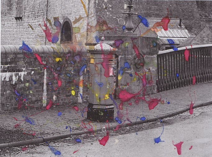
- This image shows a postbox, on an old, Victorian themed road.
- I was really inspired by the work of Richter for this piece, only colouring in the items which were bright and that I wanted to be the main focus.
- To manipulate this image, I simply painted over the objects. with matching colours.
- However, I found that this, among with my little skill in painting, made the image look childish and not something my audience would want to see.
- The image has been printed by an inkjet printer, which gives a low quality image. This adds a more vintage mood to the image, which I do like.
- I have cropped in the image, it was originally landscape, which allowed me to focus on the postbox more. However, I feel like the paint is too thick in some areas and too light in others, which may make the audience want to focus on something else.
- The light in this shot is natural and illuminates the left of the background. This again distracts from the main focus, the postbox.
- I do however, like the idea of the paint being on the image and adding the colour in, it seems to make the images more interesting and if used correctly could add a style or define an image.

- Here, I used the paint to create lines, in a similar way to Maria Aparico Puentes, to draw the audience around the page.
- I do like this effect on the paper, however the lines are not as straight as I wanted.
- Another idea is to use thin strips of paint, or even pen to do this.
- I decided to use red to match the stereotypical postbox colour.
- Another thing that this piece has inspired me to do is use a contact sheet holder in the darkroom to create lines through my images, to slightly distort them.
- This image is the landscape version of the image above, I chose this to allow the lines to stretch further. This again would draw the audiences attention around the page.
- This image is digital based and I have simply added a black and white filter and adjusting the levels when editing, I have chosen to use the black and white, because I was inspired by Gerhard Richter. The black and white image allows the red to be the main focus, as the colours contrast.
- There is a slight narrow depth of field, around f8, to allow the audience to see the main focus and some of the background clearly. I feel like this is also backed up by the red colour.


~~~~~~~~~~~~~~~~~~~~~~~~~~~~~~~~~~~~~~~~~~~~~~~~~~~~~~~~
Cut and paste task:
For this task, we have been asked to create a collage with hand manipulation, instead of digital. I had a few ideas already, like having images on top of patterns and adding patterns to images. But I found that in the middle of the task that my images were too basic and I wanted to use images that fit in more with my theme and fit my audience more.
My work:

This image is a Sellotape transfer over blue and white checked fabric. I had this idea originally as it uses substances that can be used. The paper used is Sellotape, where the ink has been transferred from the paper with water. Before doing this, I edited the image with the 'sketch' filter in photoshop, to remove the colour and to only show the outline of the image. Previously this has worked well.
The light is natural, hitting the left of the image more and the f number being around 11, producing a wider depth of field, this makes at least half the frame in focus. Due to the Sellotape having to overlap, for the process to work, there is lines in the image which may distract the audience. Another way of fixing this is using assotate or a similar substance where it doesn't need to be joined. This image does not really fit in the conventional sense of cut and paste, however, could work for future projects.
 This image uses 4 different versions of the same images, 1 black and white and the other 3 different colours. I cut them all into diamonds and stuck them on the black and white base. The paper used is ink jet, which gives the image a slightly lower quality and allows the stuck in pieces to appear 3d. This also acts as a sign that the image has been hand manipulated, and not digitally. There is no movement in the image, provided by a fast shutter speed, this directs the audience to the model and also makes the audience clearer to the intended meaning and output. The colours are used are the primary colours and gives the image a bright and saturated look. This is also helpful by the black and white base, which allows the colours to contrast.
When cutting the shape, I tried to get as close to the pattern as possible, to allow it to merge more into the image, however, this was difficult to the right of cut out.

 This image also uses fabric on top of an image, I thought this idea would be a good way of masking the true theme and idea surrounding the image, however I feel like it just made the audience want to look away from the image. I chose the blue fabric to match the sky color, however the print became to distracting from the image. I think using a black or dark fabric would have been better, to contrast with a bright image and to draw the audiences attention to the lines of image, instead of the fabric.
This was just a test piece gained from images off google. I used a typical landscape, showing the habitat of giraffes and printed a square of giraffe print. I then printed the giraffe shape and stuck it on. This is similar to the image above with the postbox, as it masks identity and also gives a 3D effect to the image. The audience can interact with the image. The images were both printed on inkjet, however were large images and gave a higher quality.

~~~~~~~~~~~~~~~~~~~~~~~~~~~~~~~~~~~~~~~~~~~~~~~~~~~~~~~~
No comments:
Post a Comment